

UX AF Website Redesign
UX AF Website Redesign
UX AF Website Redesign
Website Design | UX Research
3 Months
2024
My Role - UX Researcher
I selected my professor's design agency website, UX-AF, for analysis in my User Experience and Usability course. The agency helps organizations improve their digital products through UX research, but the website lacks detailed service information and has navigation and accessibility issues that need improvement.
I selected my professor's design agency website, UX-AF, for analysis in my User Experience and Usability course. The agency helps organizations improve their digital products through UX research, but the website lacks detailed service information and has navigation and accessibility issues that need improvement.
Problem Statement
UX-AF's website encounters challenges such as inadequate service details and navigation difficulties, which impact the user experience. Accessibility issues further exacerbate UI problems. From a business perspective, these obstacles hinder customer acquisition and retention. The objective is to optimize the website to enhance user experience and improve business outcomes by addressing these multifaceted issues.
UX-AF's website encounters challenges such as inadequate service details and navigation difficulties, which impact the user experience. Accessibility issues further exacerbate UI problems. From a business perspective, these obstacles hinder customer acquisition and retention. The objective is to optimize the website to enhance user experience and improve business outcomes by addressing these multifaceted issues.
Possible Solution
To comprehensively address the challenges faced by UX-AF's website, a complete overhaul and redesign are essential. This includes implementing a heuristics-driven approach, restructuring navigation for intuitive user flow, incorporating accessible design elements, and creating dedicated sections for detailed service information. Conducting user testing throughout the redesign process ensured a user-friendly and business-optimized outcome.
Design Process
Understand user's needs and continuously deliver outcomes.
Design Process
Understand user's needs and continuously deliver outcomes.
Design Process
Understand user's needs and continuously deliver outcomes.
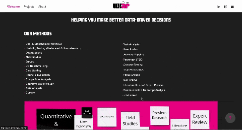
Heuristic Analysis
Findings from the website will be conducted using Nielsen’s Heuristic List researched and created by Jakob Nielsen.
Heuristic Analysis
Findings from the website will be conducted using Nielsen’s Heuristic List researched and created by Jakob Nielsen.
Positive Findings
There are several positives in terms of the UI that have been followed.
There are very minimal pages on the website.
Lots of room for improvement and can boost the business.
Positive Findings
There are several positives in terms of the UI that have been followed.
There are very minimal pages on the website.
Lots of room for improvement and can boost the business.
Negative Findings
No CTA button.
Lots of navigation issues.
Too much information is provided on a single page.
The UI can be made even more aesthetic and minimal along with being accessible.
Negative Findings
No CTA button.
Lots of navigation issues.
Too much information is provided on a single page.
The UI can be made even more aesthetic and minimal along with being accessible.
Accessibility Audit
Findings from the website will be conducted using Nielsen’s Heuristic List researched and created by Jakob Nielsen.

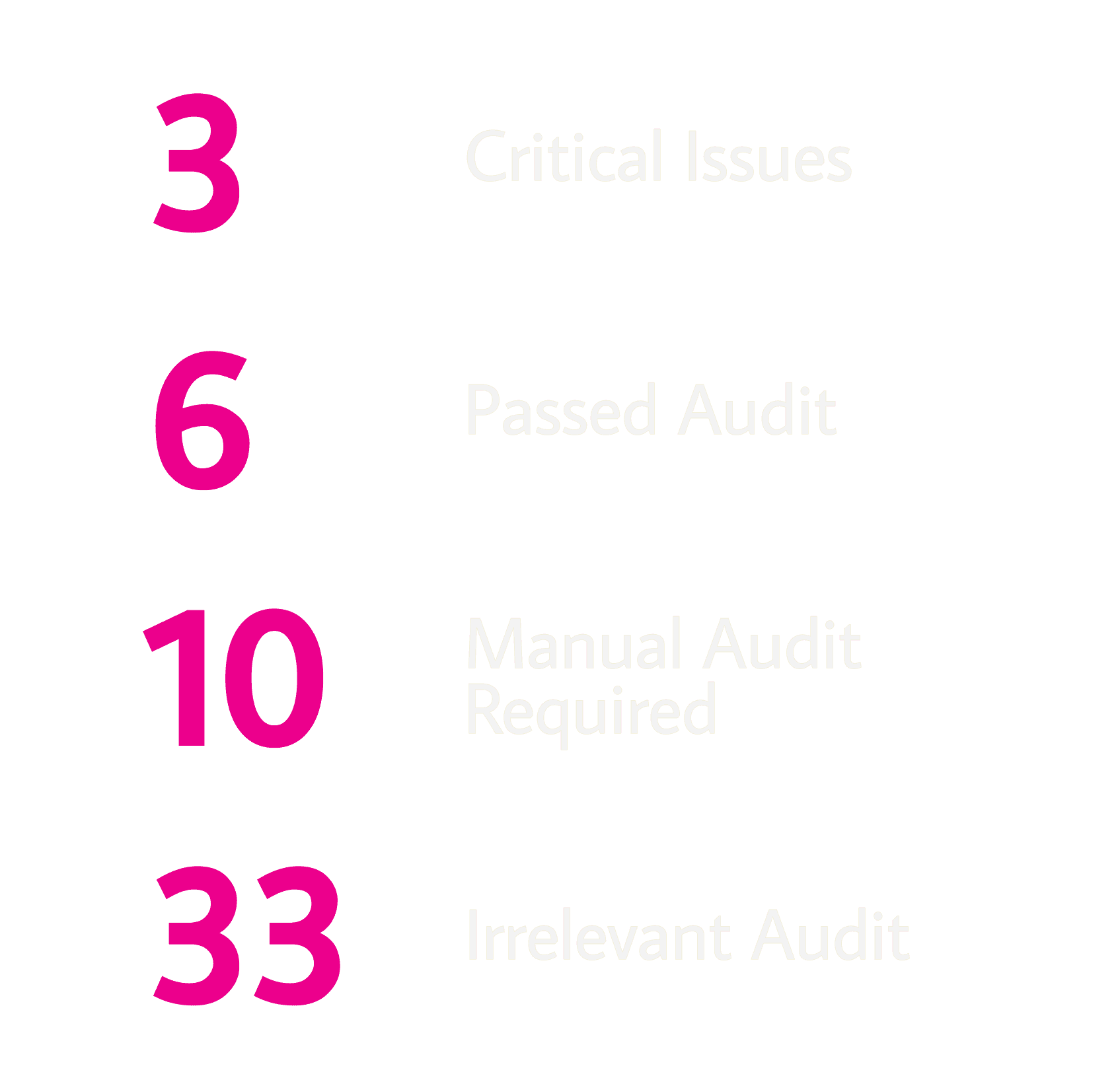
Accessibility Audit
Findings from the website will be conducted using Nielsen’s Heuristic List researched and created by Jakob Nielsen.
Accessibility Audit
Findings from the website will be conducted using Nielsen’s Heuristic List researched and created by Jakob Nielsen.
Persona


Based on the research results, three personas were created to represent the range of the user base.
Based on the research results, three personas were created to represent the range of the user base.
User Story
User Persona - Student Bruce
User Story
“As a freelancer, I would like to get more leads from the website so that I can get more business and expand my company”
Acceptance criteria
Users must be able to view all the services that the platform offers.
Users should get a clear understanding of each service and their stages.User Story
“As a current student, I would want to see the schedule of work and timelines including the updates related to my website building so that I can plan and get the budget required”
Acceptance criteria
Users must have a login option
Users must be able to view and see the status and timelines of their projects
User Persona - Advocate Jasmine
User Story
“As a busy working professional, I would like to see the website pop up at the start of the search so I can feel it as a highly reviewed website to approach”
Acceptance criteria
Users must be able to see the firm's website at the top of the search by optimizing SEO.
Users shouldn’t find it difficult to find the website and navigate through it.User Story
“As a working professional, I would like to get in touch with them constantly so that I can suggest and get enlightened about the things to be incorporated on my website”
Acceptance criteria
Users should be able to see a Contact Us button right after they land on the website homepage in case of any queries/ difficulties.
The website should be responsible since users might use mobile phones, tablets, and laptops
User Story
User Persona - Student Bruce
User Story
“As a freelancer, I would like to get more leads from the website so that I can get more business and expand my company”
Acceptance criteria
Users must be able to view all the services that the platform offers.
Users should get a clear understanding of each service and their stages.User Story
“As a current student, I would want to see the schedule of work and timelines including the updates related to my website building so that I can plan and get the budget required”
Acceptance criteria
Users must have a login option
Users must be able to view and see the status and timelines of their projects
User Persona - Advocate Jasmine
User Story
“As a busy working professional, I would like to see the website pop up at the start of the search so I can feel it as a highly reviewed website to approach”
Acceptance criteria
Users must be able to see the firm's website at the top of the search by optimizing SEO.
Users shouldn’t find it difficult to find the website and navigate through it.User Story
“As a working professional, I would like to get in touch with them constantly so that I can suggest and get enlightened about the things to be incorporated on my website”
Acceptance criteria
Users should be able to see a Contact Us button right after they land on the website homepage in case of any queries/ difficulties.
The website should be responsible since users might use mobile phones, tablets, and laptops
Methodology Overview
1. Pre-Test Questionnaire: This questionnaire helped me understand the audience better. It also helped segregate real users into the previously defined user personas.
2. Consent form: The participants signed consent forms to confirm that they were aware they would be taking part in a study for UX-AF.
3. Usability Test Plan Dashboard: The objectives, responsibilities, test tasks, and procedures for the usability tests are briefly outlined in the test plan.
4. Scenarios and Tasks: These are created from the user stories, that were derived from the user personas.
5. Test Script: Script for conducting the usability test following all scenarios, tasks, and the usability test plan dashboard.
6. Observation Sheet: Sheet for recording participant behavior and comments during the usability test. This helps capture participants' emotions while they are performing the tasks.
7. Post-Test Questionnaire: Asked, post the usability test to inquire about their experience with the UX-AF Website.
8. Usability Spreadsheet: Reporting the task performance, times, and issues noted from the observation sheet and suggest solutions to fix them.
Usability Testing
I conducted USABILITY testing online with 5 participants following the scripts, scenarios, and tasks.
Usability Testing
I conducted USABILITY testing online with 5 participants following the scripts, scenarios, and tasks.
Scenario 1: You are planning to create a website for your startup. Use UX-AF to check their projects and see if they align with your needs.
Scenario 2: You want to get an assessment for your current website. Find out how to approach the company from the website.
Scenario 3: You are concerned about how good and effective the previously undertaken works are by UX-AF. Find out what the previous users have said about the website.
Scenario 4: You wish to work for UX-AF as an Intern.
Followed by a series of Post-Test Questionnaires.
1. How would you describe your overall experience with the website?
2. What did you like the most about using this website?
3. What did you like the least?
4. What, if anything, surprised you about the experience?
5. What, if anything, caused you frustration?
6. On a scale from 1 to 5 (1=not at all likely, 5=very likely), how likely are you to recommend this product to a friend?

Key Insights

Study Highlights
90% of participants disliked the UI of the website
1/5 described the images as high-quality
100% had difficulty finding how to contact the company
100% found the section for works
4/5 participants responded favorably to task number 2
Study Highlights
90% of participants disliked the UI of the website
1/5 described the images as high-quality
100% had difficulty finding how to contact the company
100% found the section for works
4/5 participants responded favorably to task number 2
Key Insights
Study Highlights
90% of participants disliked the UI of the website
1/5 described the images as high-quality
100% had difficulty finding how to contact the company
100% found the section for works
4/5 participants responded favorably to task number 2
How did we fix this Problem?
1
Re-design the entire user flow following WCAG 2.2 guidelines and incorporating standard interactions.
Re-design the entire user flow following WCAG 2.2 guidelines and incorporating standard interactions.
2
A major need for the website is to have a Call to action Button visible, right after the user lands on the landing page. Getting in touch with the business was pretty difficult and confusing.
A major need for the website is to have a Call to action Button visible, right after the user lands on the landing page. Getting in touch with the business was pretty difficult and confusing.
3
Adding a section of reviews and feedbacks would help build trust for the users approaching this platform for any service.
Adding a section of reviews and feedbacks would help build trust for the users approaching this platform for any service.
View the Full Research Document Here
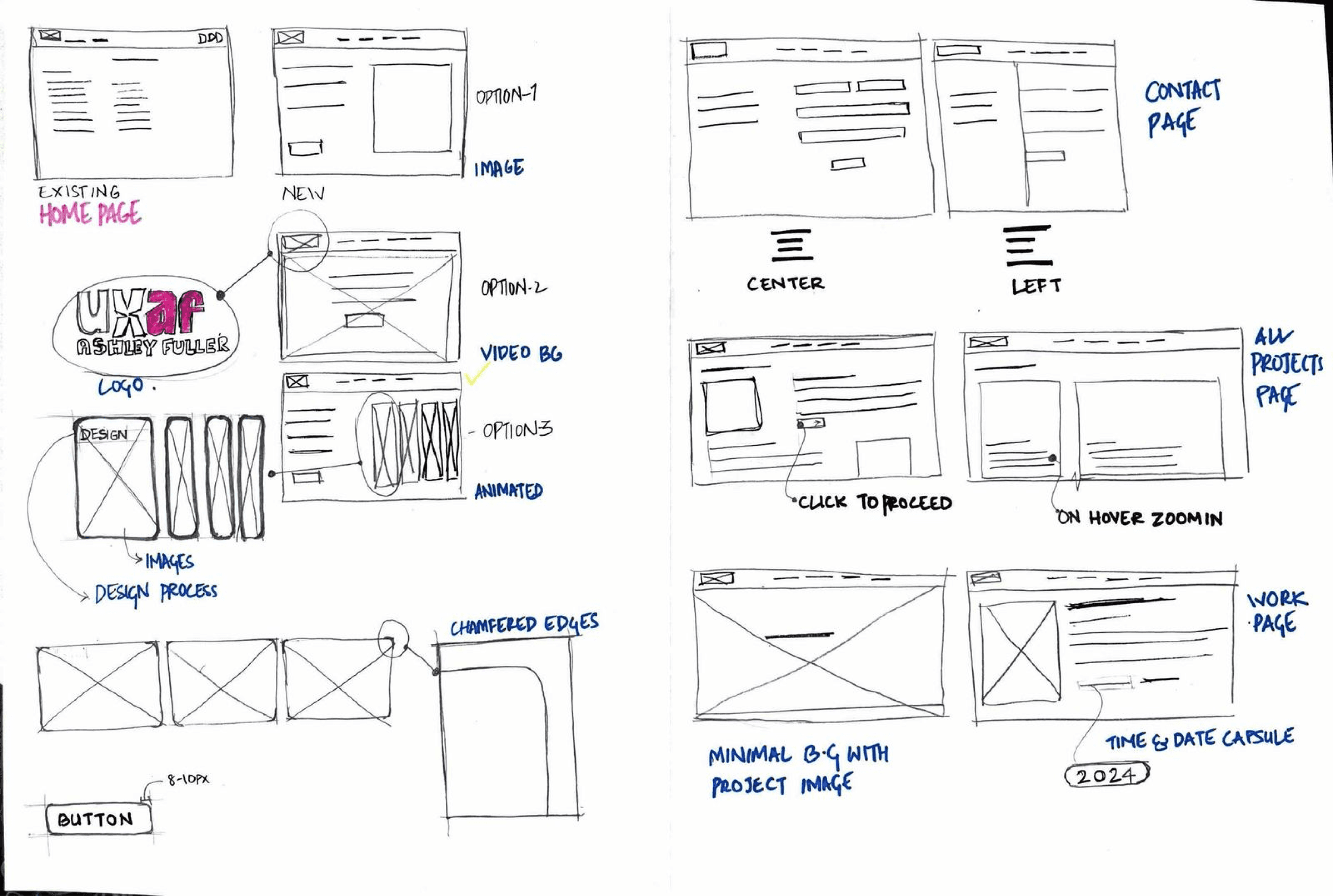
Lo-Fidelity Screens
Utilizing the valuable insights gathered, I initiated the design process by meticulously creating old-school paper wireframes. This approach not only allowed me to tap into a wellspring of creativity, but also facilitated a more immersive exploration of design possibilities.
Lo-Fidelity Screens
Utilizing the valuable insights gathered, I initiated the design process by meticulously creating old-school paper wireframes. This approach not only allowed me to tap into a wellspring of creativity, but also facilitated a more immersive exploration of design possibilities.
Design System

Design System
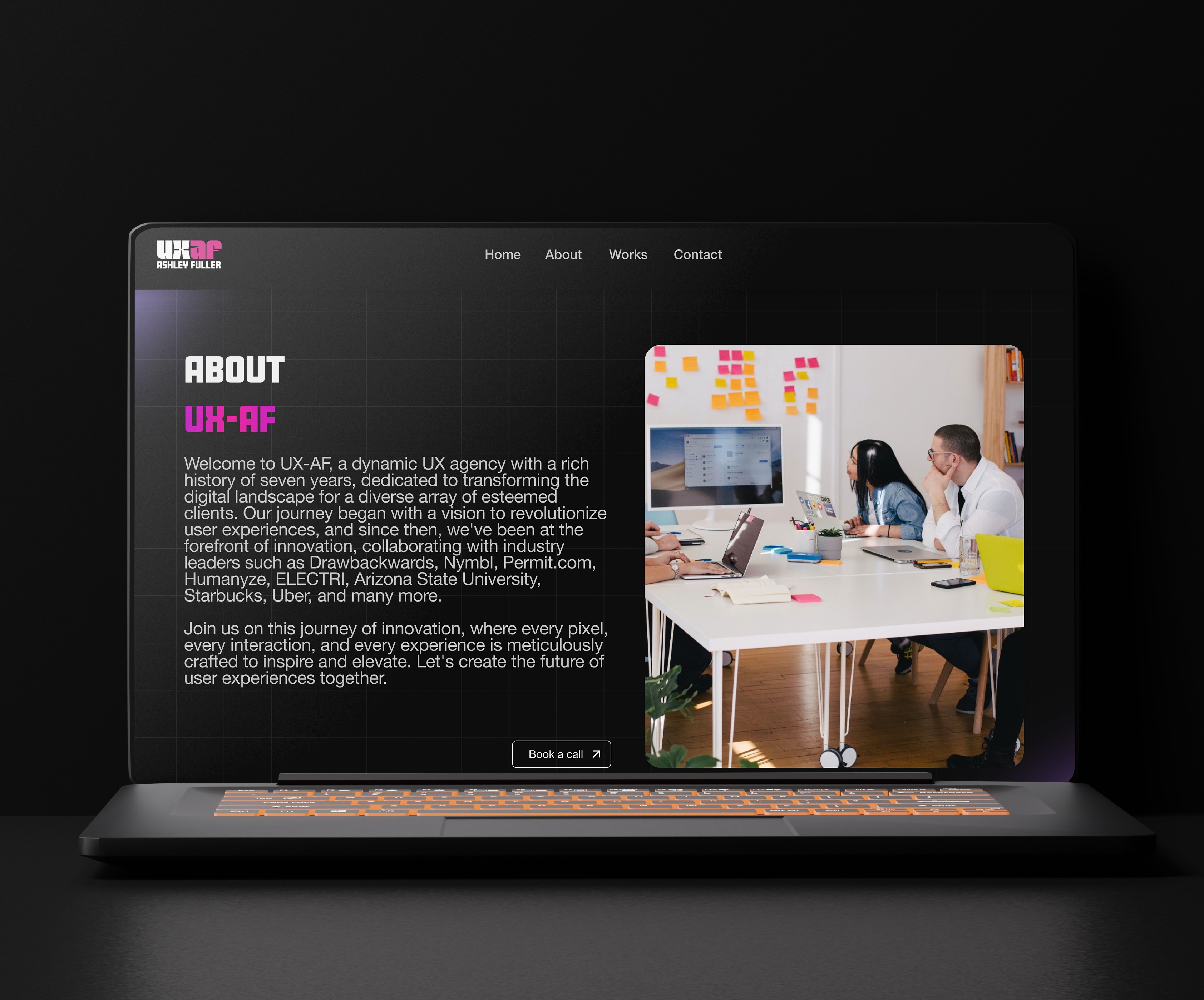
Hi-Fidelity Screens
I transitioned to high-fidelity screens, meticulously crafting a visually refined user interface.
This process, rooted in user feedback and iterative refinement, aimed for an intuitive and engaging design. Adhering to WCAG 2.2 Guidelines, the interface prioritizes accessibility, ensuring inclusivity for all users. Embracing a minimalistic approach, the design maintains simplicity and focuses on essential elements for enhanced user comprehension.
These high-fidelity screens encapsulate a user-centric and inclusive philosophy, ready for evaluation and refinement before final implementation.


Key Changes Made
The website's entire user experience has been revamped based on user testing results. Below are the key changes made.
Key Changes Made
The website's entire user experience has been revamped based on user testing results. Below are the key changes made.

Presenting the new landing page, now featuring a prominent CALL TO ACTION button. This enhancement is designed to optimize user engagement from the outset, offering a more intuitive and responsive interface for visitors.
Presenting the new landing page, now featuring a prominent CALL TO ACTION button. This enhancement is designed to optimize user engagement from the outset, offering a more intuitive and responsive interface for visitors.
Implemented a CALL TO ACTION button immediately upon landing on the page, enhancing user accessibility to engage with the business effortlessly. This strategic addition aims to prompt swift user interaction, making it easier for visitors to initiate contact with the company from the moment they arrive on the landing page.
Implemented a CALL TO ACTION button immediately upon landing on the page, enhancing user accessibility to engage with the business effortlessly. This strategic addition aims to prompt swift user interaction, making it easier for visitors to initiate contact with the company from the moment they arrive on the landing page.

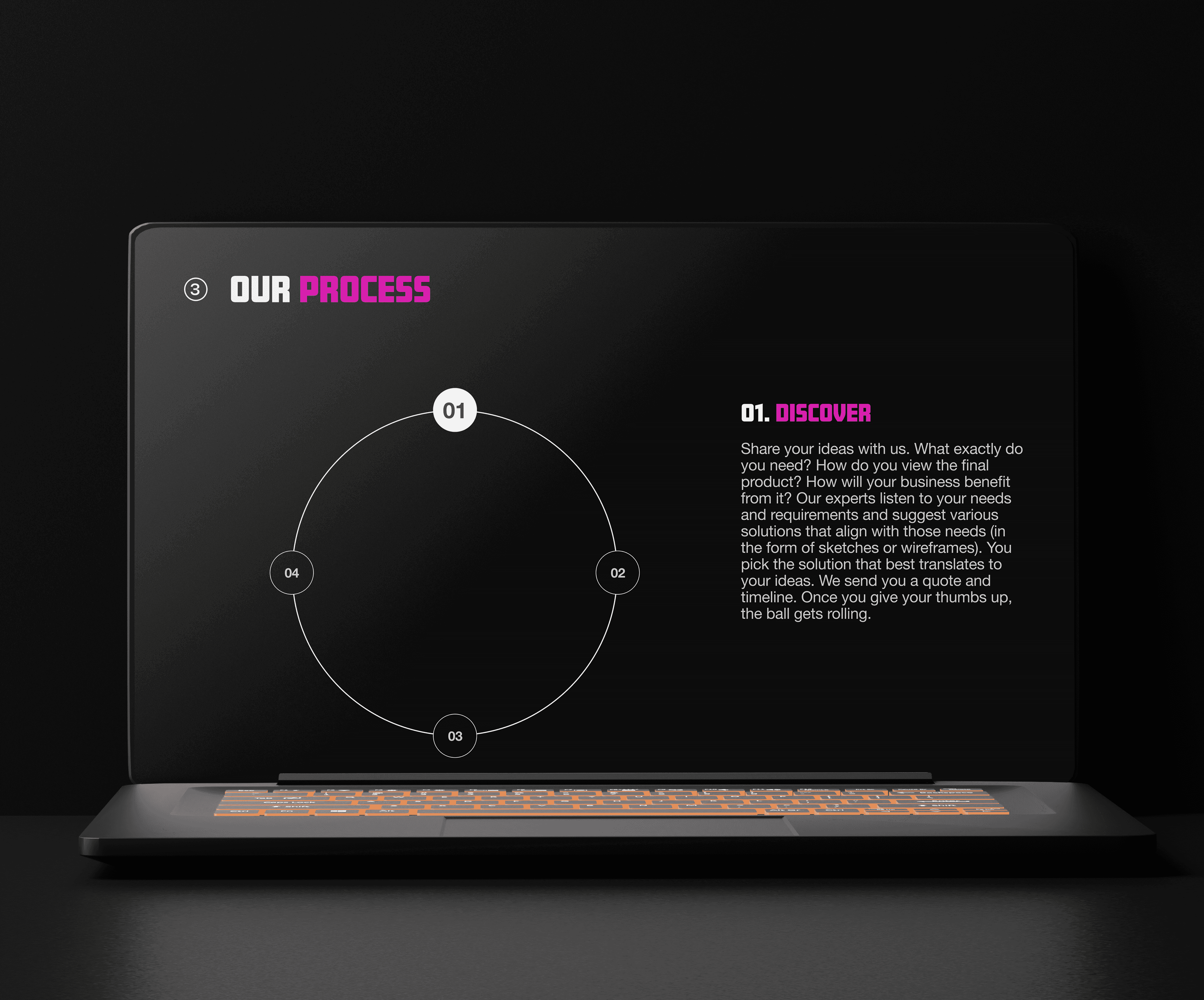
Redesigned "Our Process" page with a streamlined landing experience. The iterated design prioritizes micro-interactions, ensuring a seamless journey for users as they navigate through the entire work process without any disruptions. The revamped layout minimizes clutter, offering users a clean and intuitive interface to effortlessly engage with the content.
Redesigned "Our Process" page with a streamlined landing experience. The iterated design prioritizes micro-interactions, ensuring a seamless journey for users as they navigate through the entire work process without any disruptions. The revamped layout minimizes clutter, offering users a clean and intuitive interface to effortlessly engage with the content.
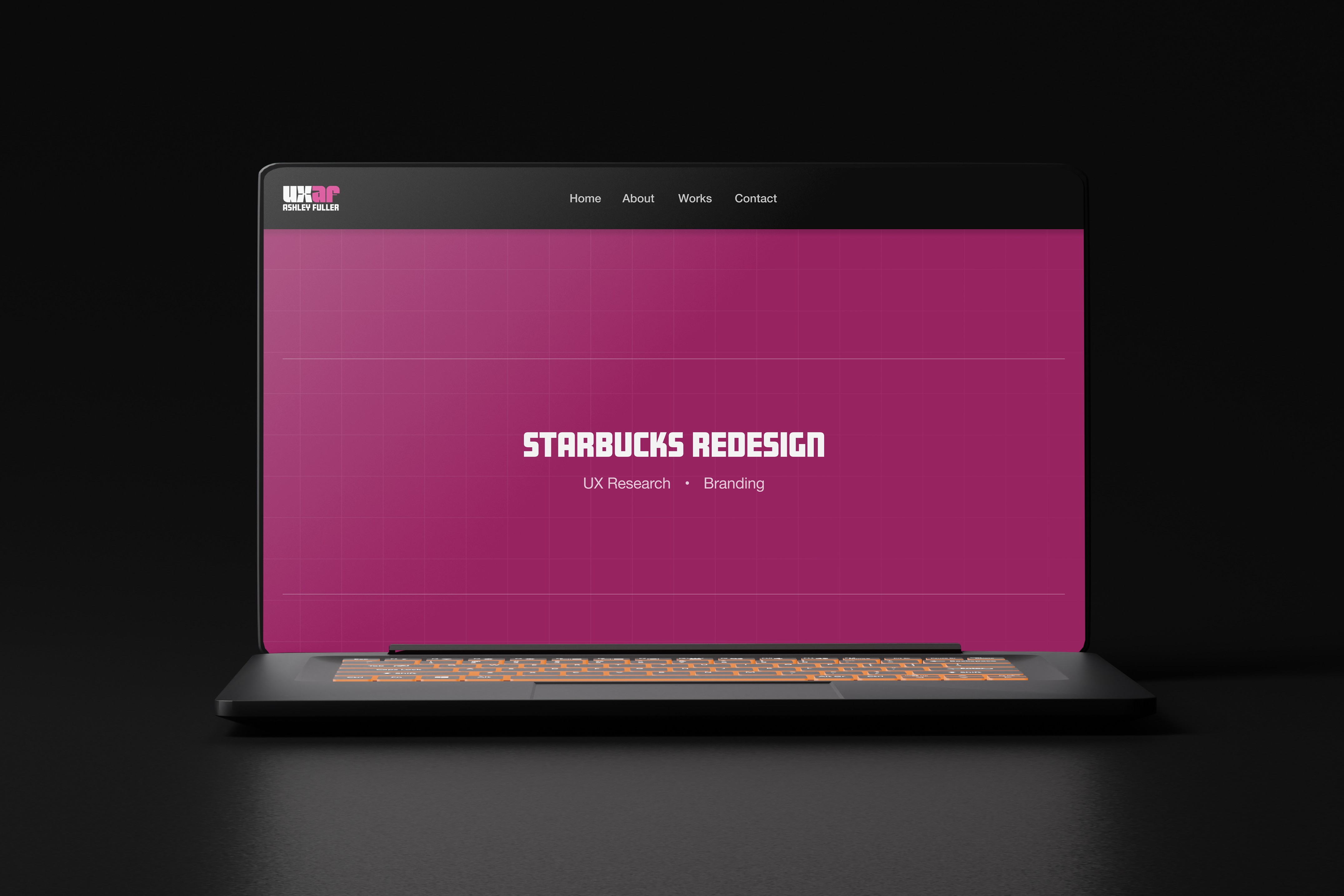
Presenting the revamped "Our Works & Case Studies" page featuring micro-interactions and non-password-protected files. This user-friendly design aims to provide customers with a seamless experience, allowing easy access to a comprehensive understanding of the firm's work without the need for passwords.
Presenting the revamped "Our Works & Case Studies" page featuring micro-interactions and non-password-protected files. This user-friendly design aims to provide customers with a seamless experience, allowing easy access to a comprehensive understanding of the firm's work without the need for passwords.
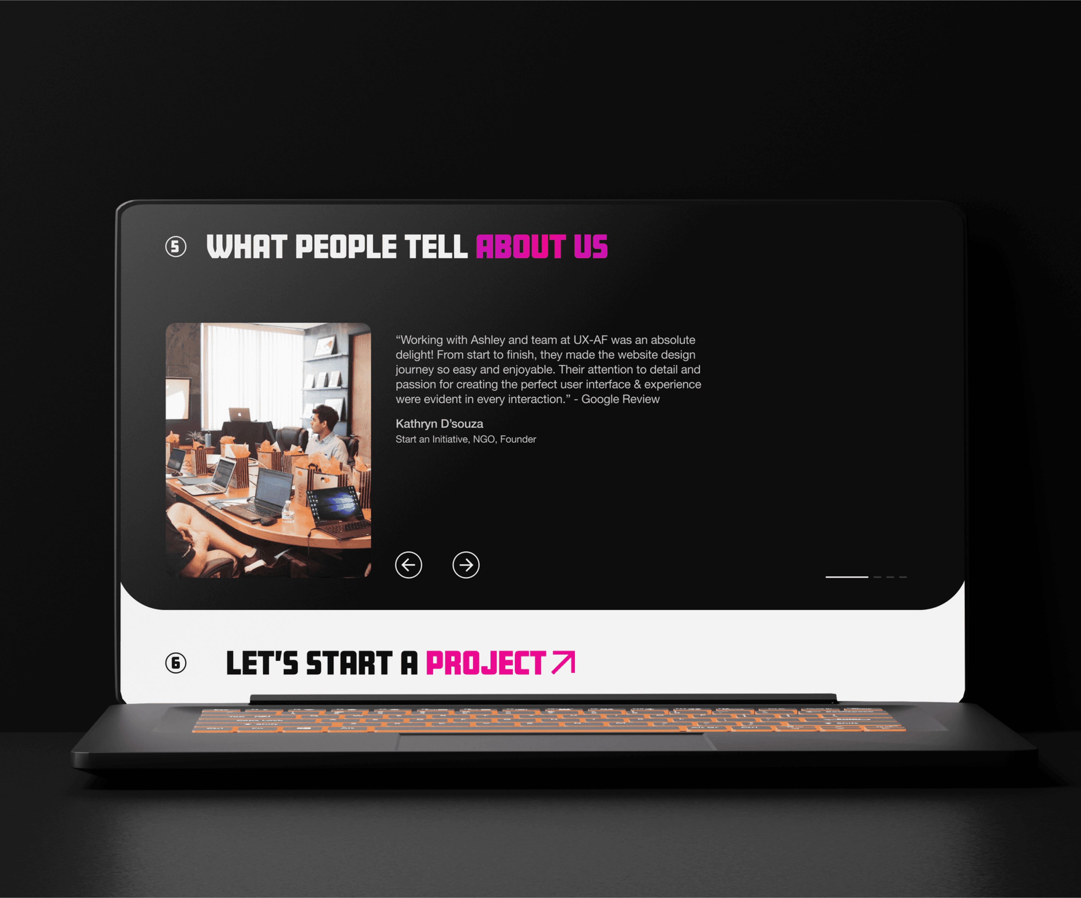
I've incorporated a section for reviews and feedback to enhance user trust and attract more customers. This feature is instrumental in building a positive reputation for the business, fostering credibility, and ultimately contributing to business growth.
I've incorporated a section for reviews and feedback to enhance user trust and attract more customers. This feature is instrumental in building a positive reputation for the business, fostering credibility, and ultimately contributing to business growth.
I have implemented a section where users seeking a job role within this particular company can find active job postings. This platform also facilitates the company's expansion by attracting potential candidates to join our team, aligning with the company's growth trajectory.
I have implemented a section where users seeking a job role within this particular company can find active job postings. This platform also facilitates the company's expansion by attracting potential candidates to join our team, aligning with the company's growth trajectory.

Prototype
"The website feels usable and aesthetic"
Results

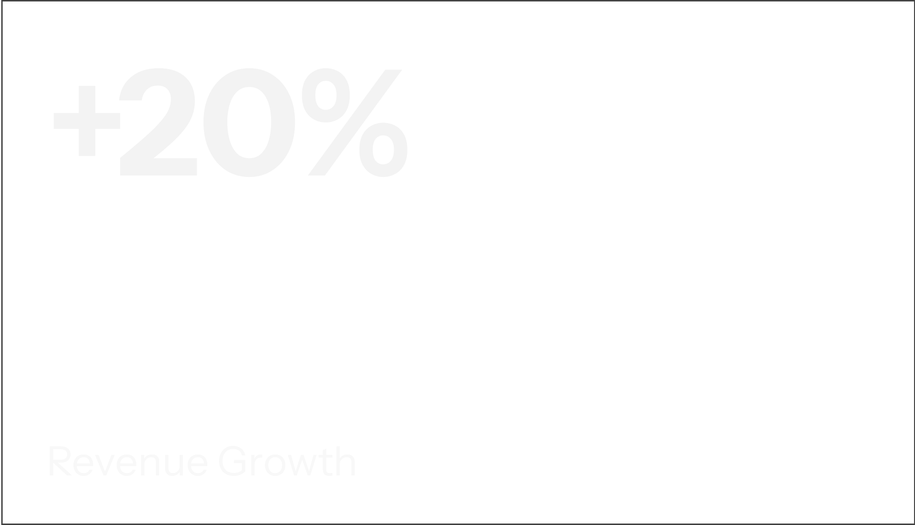

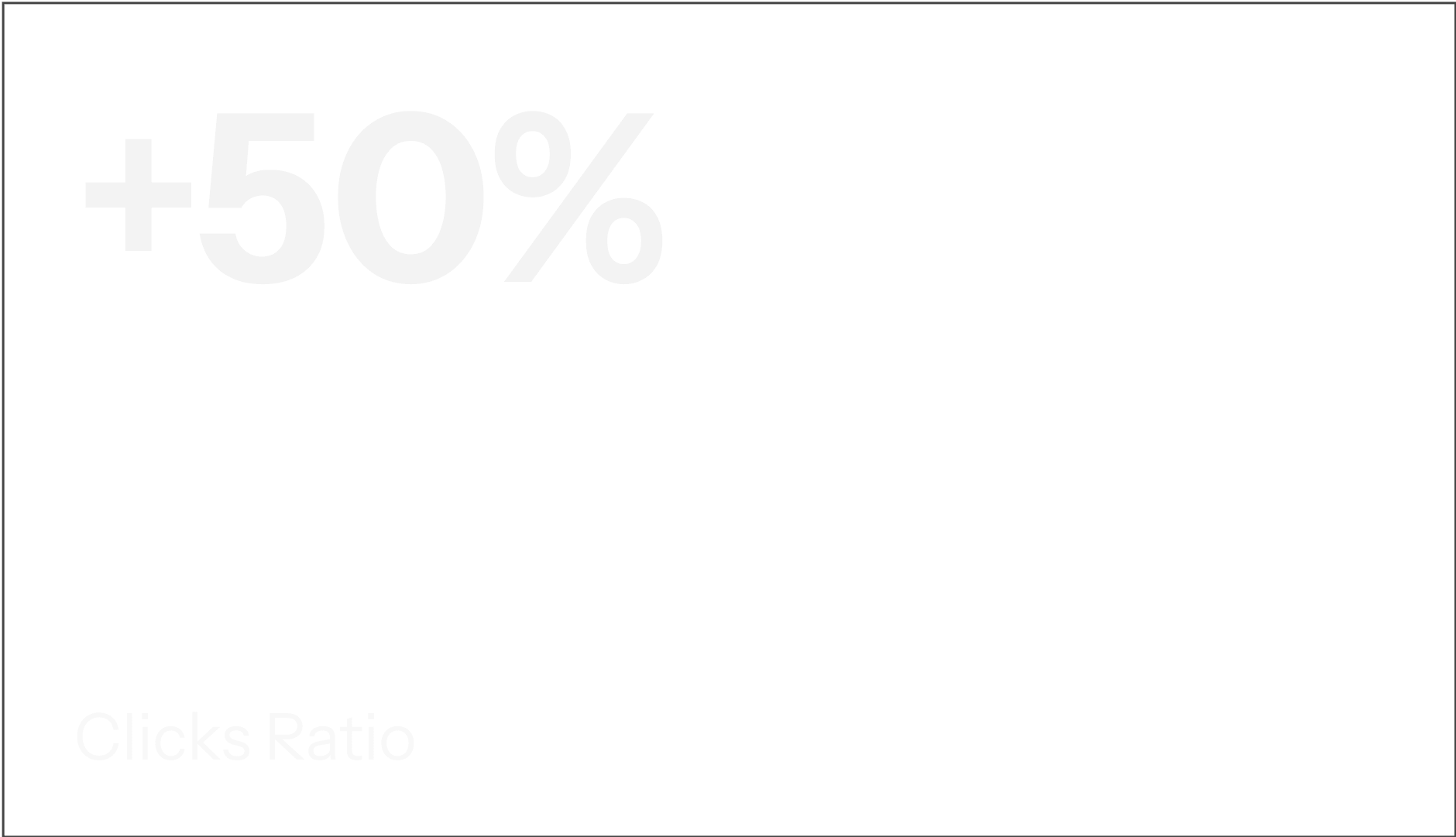
Results
Future Scope
The project is currently in the iterative phase with the client and will move toward development.
After the User testing of the final designed product, the users were able to complete the tasks they weren't able to on the current site. Time on task was also greatly reduced.
There are a few expansions in the product that I had pitched to the client and might be designed later during the second phase.
Have a client section on the website.
Make a back-end dashboard to update the status and projects by the client.
Learnings
Initial research suggested a major deficiency in the visual design of the site. However, the in-depth analysis revealed that the primary issue lay in user flow and navigation rather than visual aesthetics. This shift in understanding prompted a strategic focus on enhancing the user journey and navigation elements to address the core usability concerns.


